Consumers increasingly rely on the mobile devices to search and view your website, which makes it more important than ever that company must provide an easy to use mobile experience. Responsive design websites deliver an optimal website navigation experience across every device – desktop, mobile, and tablet. The website layout will automatically change depending on the size of the device screen.
Responsive website contains all your information rather than simply a “scaled down” version of a desktop site. With responsive design, users can experience your website consistently across all devices and screens in a user-friendly format - no more scrolling, pinching and zooming through a site. Responsive design's ease of use and familiarity encourages consumers to stay on your site longer and increases the potential for conversion.
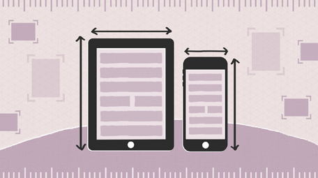
Discovery Ad's Responsive Website Design Solution
Building Your Website Work Across Multiple Devices

Today’s consumers are ready to connect with your business on screens of all types and sizes - from smartphones and tablets to laptops and desktops. That’s a huge new opportunity, but only if your website is designed to give customers what they need on smaller smartphone screens as well as tablets and desktops. This can be a challenge, but we hope to make it simpler for your business.
Discovery Ad's web development services assist our clients with designing and building a responsive website that showcases your business on every screen from smartphones and tablets to laptops and desktops.
Our team works with each client to understand their brand, markets, products/services, competition and preferences in order to produce a custom website tailored to their needs. We build a professional responsive website that represents your business in the best possible way. We take the guesswork and uncertainty out of building a responsive website.
THE GOALS:
- Enable a better mobile experience for customers
- Deliver a consistent user experience across devices
- Consolidate content into a single site
- Enable potential customers to find the right information on any screen size
THE APPROACH:
- Used responsive web design to build new site
- Replaced existing sites with new website built using responsive web design
- Created mobile-friendly site with larger buttons, click-to-call, smaller graphics and less text
Your responsive website is optimized for tablets and smartphones, its clean design and simple navigation make it easy for visitors to find what they’re looking for and contact you.
We can take your current desktop site and create a responsive design version for your business.
When building your site, Discovery Ad makes website architecture a priority.
- Professional design that presents your brand, products and services
- On-site Search Engine Optimization (SEO) and search-optimized content
- User Experience (UX) – Simple, easy to use Navigation
- Tracking technology that captures the source of each visit
- Organization of key content and placement of images, charts, graphs, etc
- Concise, relevant information, clear “Calls to Action” & quickly recognizable links
for a Free Consultation today to discuss developing a Responsive Website for your company!
Why Mobile Optimized Websites
Customers are increasingly searching and viewing your site on mobile
devices. They don’t have much patience for pinching and scrolling full-sized
pages that don’t fit a mobile screen. Websites must now fit the needs of
customers on all screens, from desktop displays to smart phones. The companies
who are creating a positive mobile experience will definitely have an
advantage.
- Mobile-friendly sites turn users into customers
- Not having a mobile-friendly site helps your competitors
- Non-mobile friendly sites can hurt a company's reputation
For best results, send your users to a mobile-optimized website that
makes it easier for them to view on their smaller screens. Make sure your site
looks great on small mobile screens, is simple to use, and provides all the
information users are looking for. Your customers expect a great browsing experience
regardless of what device they use. Doing so will improve mobile conversion
rates.
for a Free Consultation today to discuss developing a Mobile Optimized Website for your company!
